Have you ever looked at a poster using more than font and wondered, "How doth one know what goest with what, yo?" Bold and scripty, thick and thin, even two sans serif — font pairings can play beautifully together, combining into a well-balanced design. We'll show you how to put them together.
Font categories explained
The first thing to know about fonts is that they sort into a few broad category types. In PicMonkey you'll find six main types in our text tool: Serif, Sans Serif, Handwriting, Script, Display, and Monospaced. So what's unique about each category?
Serif fonts

Serif fonts come with a little footer or flourish, lending your text a distinguished and also highly legible look. Serif fonts are tres classique since they’ve been around since before Times Old Roman. (No, seriously. Ancient Rome.) Because of their storied past, people tend to perceive them as being trustworthy or lending validity to your words.
Sans serif fonts

Sans (without in French) Serif fonts are fonts without serifs. This gives them an overall clean, modern look. Sans serif design-darlings like Helvetica and Arial are often used on minimalist designs and are believed to be more legible on a screen.
Handwriting fonts
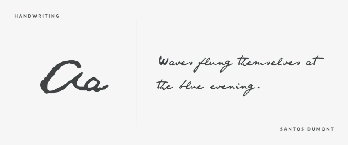
Handwriting fonts can look vastly different from font to font since they’re intended to mimic someone’s writing. Some are bold and loud, like Edo, and others are more reserved and subtle, like Sue Ellen Francisco. These casual and approachable fonts are good for craft projects and cards, but avoid them for long written missives.
Script fonts

PicMonkey’s Script fonts also come with a lot of variety. Some of them, like Bilbo Swash Caps are more calligraphic and others, like La Belle Aurora, look more like someone’s handwritten script. These are elegant fonts for special occasions like wedding or shower invitations, or for sharing an inspirational quote on social.
Display fonts

Display fonts are our quirky attention-grabbers. Spanning lots of different styles and feelings, they make great headlines and are just generally good at emphasizing your point. They’d be hard to read in a body text, but they’re great for catching someone’s eye. Fonts like Backspacer and Laughing Gull almost look like art in and of themselves.
Monospaced fonts
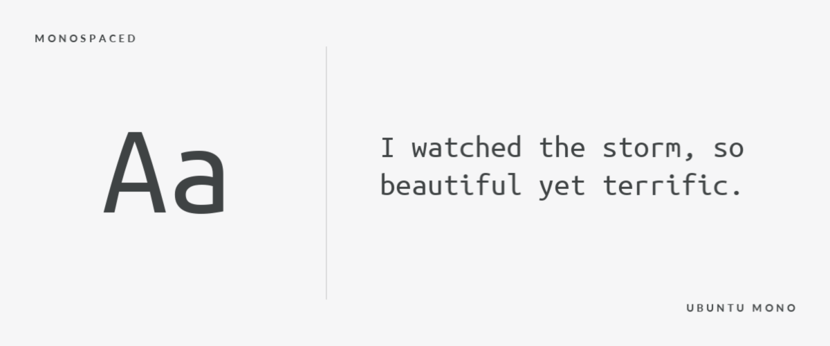
Monospaced fonts are exactly what the name suggests: each character inhabits the same amount of fixed space as the next. This category is a holdover from typewriter and early word processor days, but is still widely used because it lends an old-school vibe to text. Try Share Tech Mono for a super computer-y look, or opt for Anonymous Pro for a more refined, modern monospaced font.
How to pair fonts in designs
Now that we’ve got the font categories nailed down, let’s talk about putting them together. Not all fonts work well with other fonts, and it can be tricky and time consuming to figure that out through trial and error. But, if you keep these simple pairing ideas in mind you should end up with a beautiful design that is easy on the eyes.
Find balance when serif + sans serif get together

A natural pairing, sans serif strikes a balanced contemporary counterpart to serif’s more buttoned up appearance. Try Didonesque (serif) with Geo Sans Light (sans), or Rozha One (serif) with Hero (sans).
Pair fonts from the same category for subtle visual interest
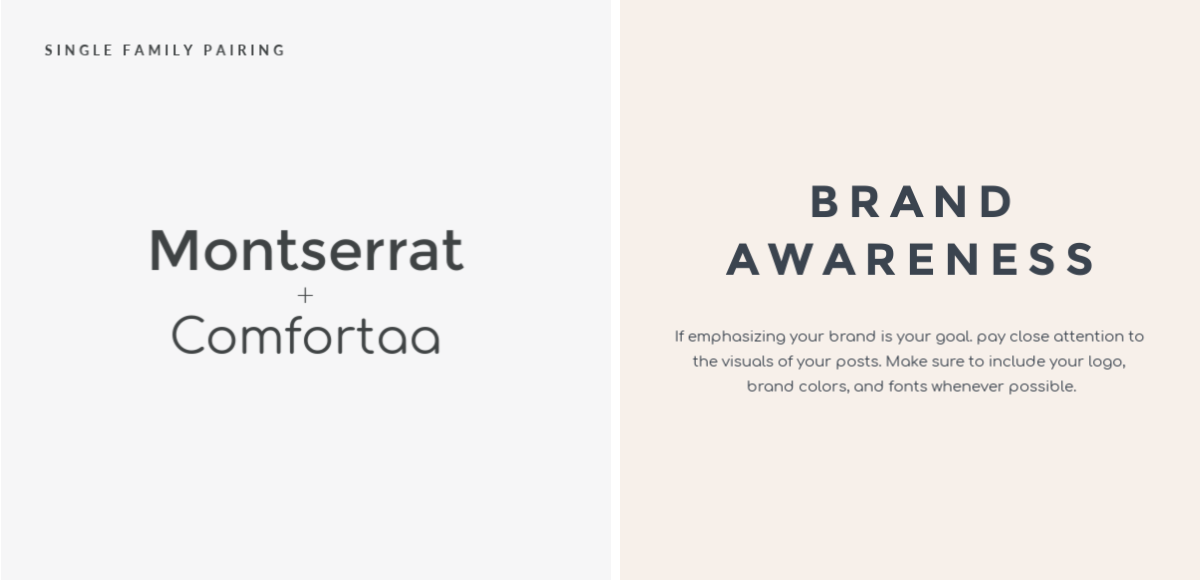
Think again if you believe that you can’t pair two font categories together. This pair of sans serif fonts are similar enough to share a certain aesthetic, but vary enough (check out the lower-case “a”) to add just that tiniest bit of complementary flavor.
Which brings us to this important public service announcement: don’t go nuts with too many fonts; stick to two or three tops. Think about it this way; you might love your polka-dotted rain jacket, neon knee-highs, and ’coon skin hat, but if you throw them on all together you’re gonna look like a hot mess because they’re all competing for attention. Think complementary, not competing.
Here are a few combos that work well for specific projects...
Display + sans serif is perfect for posters

Combine a big, bold display font with a straightforward sans serif font to create a poster that is both eye-catching as well as informative. Display fonts like Bungee or Lovelo are made for headlines, while sans serif fonts make perfect supporting characters providing all the pertinent info. Try a poster template to start your next design.
Pair script + serif for Instagram inspo
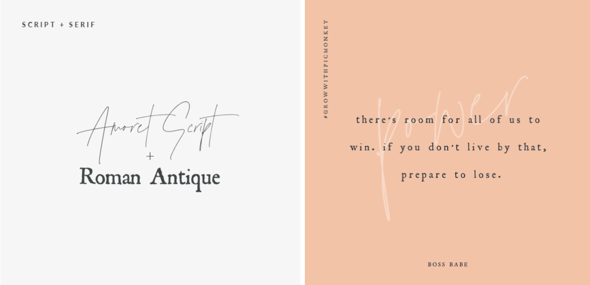
While quite fetching, script fonts aren’t always the easiest to read, so carefully sizing and using them sparingly is key for legibility. Silverline Script has that effortless it-girl flair, and when combined with a serif font — especially a vintage-y one like Harting or Underwood Champion — the look is pure aesthetic gold. Browse all our Instagram templates to get started.
Make mod brand logos by pairing within the font family

Go for it and pair fonts from within the same family by putting together a bold and a regular font weight, matching up an ALL CAPS version with lower case, or simply by making them different sizes. Notice how this also creates a hierarchy — the bolded text communicates the brand, while the regular text offers a little more information. Wanna make your own? Check out our logo templates to get going.
Try Text Layouts for one-click font pairing
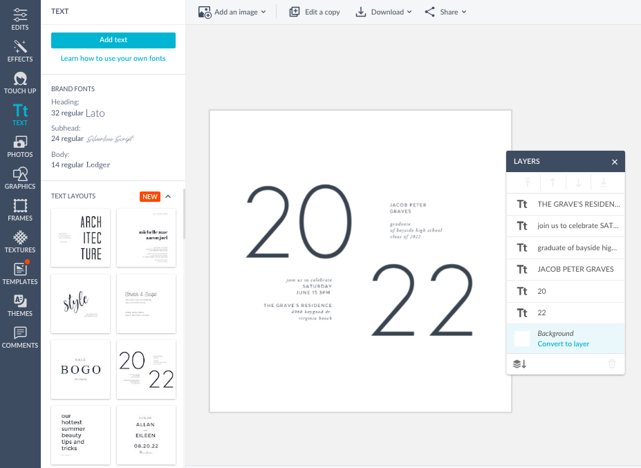
Last but certainly not least, use PicMonkey's Text Layouts to take all the guesswork out of font pairing. These pre-made layouts already play nice together, plus they are still fully customizable so you can adjust the size, color, shadow, or anything you’d do to text you added yourself. To learn more, read: Say it With Text Layouts in the Resource Center.
