When you post to Facebook you’re blasting a message because you’ve got something to share with the people who care enough to follow you, so don’t bore these good folks, amirite? Whether you post about your business’ new product line or just want to inspire your clients, you can create informative and attractive posts that will slow the scroll and add just a little more beauty to the world.
We’ve got some Facebook post ideas for all the various and sundry reasons that you might need to make a standout post—promoting sales, introducing new products, announcing events, sharing inspirational quotes, explaining how-tos—and we’ll offer ideas for how to make them in PicMonkey.
1. Dream of travel with a wanderlusty video post
Click to customize more Facebook templates
Oh how we miss traveling right now! Take yourself and your clients on a virtual holiday by featuring a post with your favorite destinations or your top travel pics or videos. You can now design with video in PicMonkey—upload your own MP4, or choose from our stock video library.
Create this look in PicMonkey by first editing the photos you want to use in your post. We’ve cropped these over a white background to get an outline, and then filtered with some stylish effects. The pics will autosave to your Hub, so when you’re ready to build your post just click Create New for a blank canvas. Add in your edited images from Hub, and apply a drop shadow to each pic by using selecting the Effects section of the Graphics palette. Substitute a pic for a video in your collage; see our tutorial on using video in design.
2. Photographically design with a film strip post
Click to customize this template
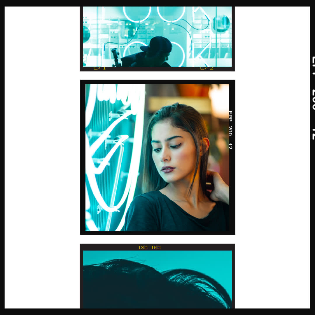
There’s more than one way to show off multiple photos at once. Try the film strip look by arranging a few photos or graphics that share a common aesthetic or theme. Think: an assortment of black and white pics to show off your recent photography, or a bunch of vegetable pics to promote your farmer’s market booth, or how about a bunch of your staff’s smiling faces to show what a friendly biz you have.
Create this look in PicMonkey by starting with a film strip frame which you'll find in the Photo Frame Graphics category. You can Crop or Resize them from the Edits tab, and arrange their placement by clicking on each image name in the Layers palette to select it.
3. Go for the IRL look with a mock up flat lay post

Click to customize this template
The flat lay + device mock up look provides an over-the-top POV that is quite pleasing to viewers because it’s easy to take in an assortment of objects quickly, while the negative space around the objects is easy on the eyes. Plus, can we just say it looks cool? You can find these types of pics in our stock photo library.
Create this look in PicMonkey by opening a photo like this, or customizing the template above. All you have to do is replace the "your image here" graphic with your own pic. Easy as pie.
4. Advertise your sales event

Click this template to customize
Are you noticing a theme among all these post ideas so far? They are all a) photo-based, and b) they use the slightest amount of text to convey a simple message. Because your viewers can click on your post to learn all the nitty-gritty deets, all you need to do is grab their attention with a nicely composed pic + a succinct message. There’s no mistaking what a “SALE” is all about!
Create this look in PicMonkey by using text effects to their fullest. In the Text palette, apply Outline with a Knockout to your text, and add a colored drop shadow to get this cool glitchy text vibe.
5. Show what’s new in store

Click this template to customize
If you have a retail shop, let your followers get a first glimpse of your new products when you show them off in a product photo post. Add in a header and footer with helpful information like your website URL or product names and you’ve just marketed in, like, minutes!
Create this look in PicMonkey by placing a torn paper graphic underneath a product photo. Add a tape graphic to really heighten the 3-D effect.
6. Announce an upcoming event
Click this template to customize
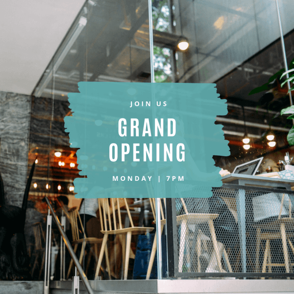
Invite your followers to your next soiree with a standout text-over-image post like this one. The white blocky font is just bold enough so that there shouldn’t be any excuses of “I didn’t see your post!”
Create this look in PicMonkey by layering your text over a partly opaque shape or graphic for extra standoutability. We used Marker Streak graphics (Graphics > Design > Marker Streak), then pumped up the transparency using the Fade slider in the Graphic palette.
7. Show off your work, get new clients
Click this template to customize
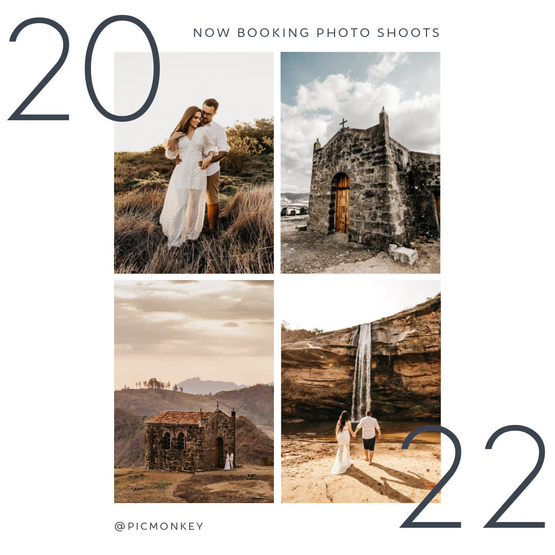
Maybe you make beautiful wedding dresses, operate a gorgeous event venue, or perhaps you are a talented photographer—in any of those cases, show off what you do with a photo post inviting potential clients to book, order, or reserve your services now. Even if there’s no hurry and your schedule is wide open, go ahead and make it seem like you’re filling up fast because you’re so in demand!
Create this look in PicMonkey by arranging a few photos in a grid-style collage, then add text on the edges. Need help pairing multiple fonts together? Check out: Learn How to Pair Fonts Like a Pro.
8. Harness the trends and don’t be afraid to use them
Click this template to customize
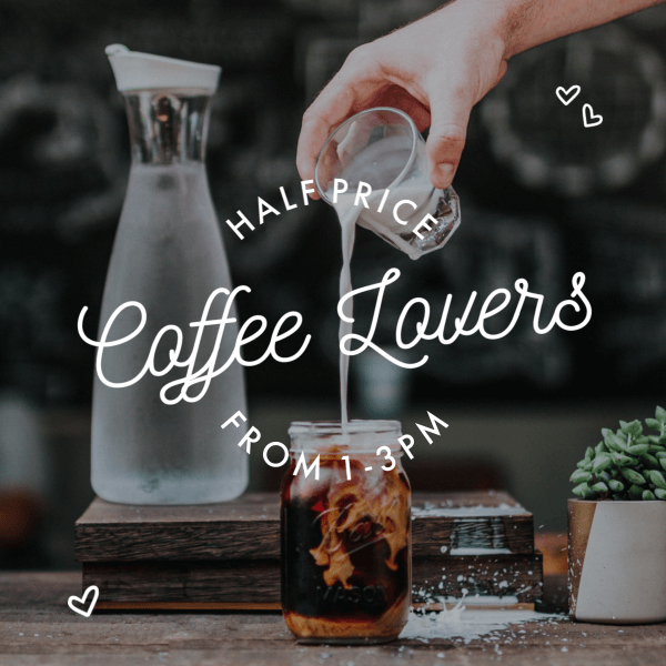
Ask yourself (or your resident young person) what’s so hot right now and put whatever trend is poppin’ in a post. For awhile it was putting birds on everything, then it was avocados everywhere, and here we have both cold brew coffee and Mason jars, two fads that are enjoying some serious longevity. Whether you’re selling accounting services (“How much are you spending on coffee each year?”), or selling actual coffee, take advantage of what’s popular and use it to grab some attention on Facebook.
Create this look in PicMonkey by reducing the brightness of your photo in Edits > Exposure to darken it just enough to make the white text on top really stand out. For added oomph, we applied a couple heart graphics (Graphics > Design > Airy Accents) and curved the text.
9. Spread the knowledge with a how-to post
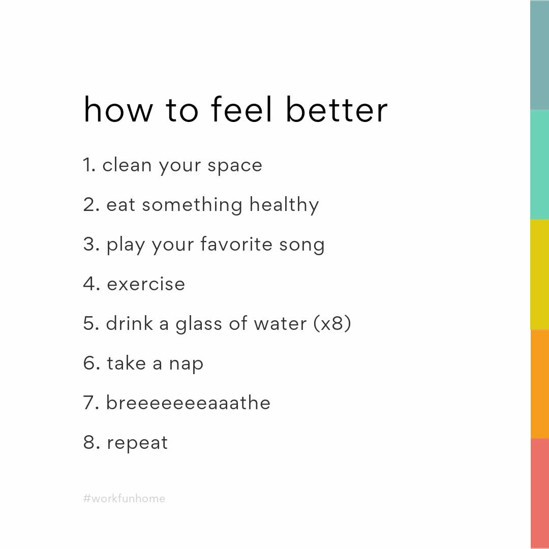
Click this template to customize
You’re full of good ideas, so share them with the world using a how-to post. You could advertise your upcoming class (a great way to get customers in the store, by the way!), or take advantage of Facebook’s ad carousel format by uploading a series of 2-10 pics to let your followers swipe through step-by-step instructions.
Create this look in PicMonkey by applying identically-sized shape graphics along the edge of your canvas. Use the color picker on the Graphic palette to change the color of each shape. You know the drill by now: add white text over a dark background to really get your message poppin’.
10. Inspire with motivational quotes & pics

Click this template to customize
Why upload a regular old photo when you could frame out your pic in a beautiful halo of graphics? You consider that for a bit, but meanwhile we’re going for graphics.
Create this look in PicMonkey with paint smears and drops (Graphics > Design) in the background, then apply your photo as a texture to a torn paper overlay (Graphics > Design > Ripped Paper) to present the image in an extra special way.
11. List what’s good with a top 10 post
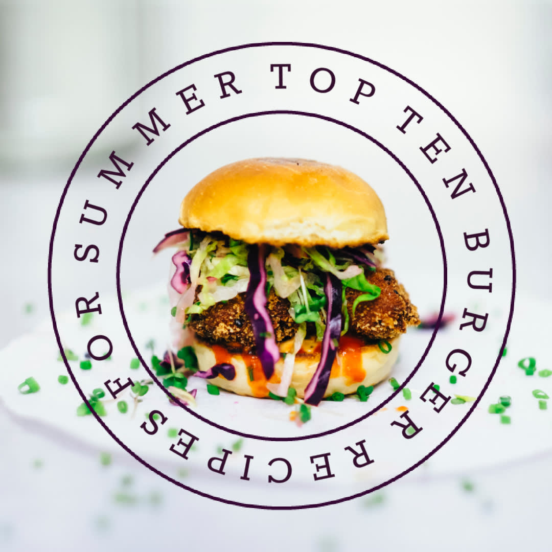
Click to customize this template
Remember that one time when we talked about the Facebook Carousel Ad format a few paragraphs ago? When you can use 2-10 photos to make a multiple-image post in Facebook, why rely on just one pic when you have, like, eight new products to introduce? Carousel ad posts are perfect for presenting a number of goods, ideas, or for demonstrating multiple steps or product features.
Create this look in PicMonkey by applying a photo filter from the Effects tab. Try Orton for an appetizing boosted color filter. Let your letters circle up by using the curved text effect in the Text tools.
12. Make a mod nod to old times with a nostalgia post
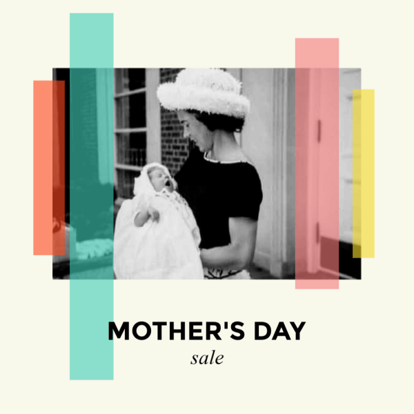
Click to customize this template
You don’t have to wait for Throwback Thursday to remember the good old days. Harken back to history with a photo of when Grandma rode the streetcar in shorts, or share a pic of your sweet collection of mix tapes to evoke a sense of “aww” in followers of a certain age, thereby connecting with some latent sense of longing for whatever it is you’re promoting.
Create this look in PicMonkey by arranging shapes over an old timey black-and-white or sepia-toned photo. In the Graphics tools, use the Fade slider on each shape to increase the transparency. The result is some stained-glass realness that’s a little bit antique and a little bit mod.
13. Tout your brand with a simple logo post

Click to customize this template
You probably put a lot of thought and effort into your business’ logo, so go ahead and show it off once in awhile in a Facebook post. If it’s on brand, you could even swap out the background colors or the text color for an occasional change. Using your logo as a photo post is a great opportunity to add a few lines of text about your mission statement, or to ask a question to engage with your followers—something like “Did you know that sparrows are our favorite bird? What’s yours?”
Create this look in PicMonkey by placing a non-distracting-yet-related photo as the background of your post. Cruise the stock photo library to find whatcha need. Add some text and you’re good to go, you logo maker you.
14. Go 3-D with a scrapbook-style post
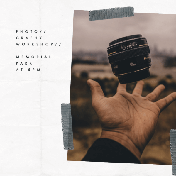
Click this template to customize
We love this textured look because the 3-D effect of creased paper along with the strips of duct tape make it really come off the screen. This style of post lends itself well to travel businesses or photographers, or really anyone who has an image they want to share along with a few lines of text.
Create this look in PicMonkey by applying a texture to your background. Go to the Textures tab and select the Paper category to find the one we used above. Add your photo to the canvas by clicking Add an image at the top of the editor. Last, type in your text, and stick on the duct tape, which you’ll find in Graphics > Scrapbooky > Tape.
15. Create an eye-catching promotional post

Click this template to customize
Let the people know that you are having a sale or offering a special discount code with a promotional post. The blocking style of this post moves the eye around the image and makes it more interesting to read.
Create this look in PicMonkey by starting with a photo background, then adding those semi-transparent shapes we love so much (Graphics > Basic > Shapes), and finally slapping some big, bold letters on top.
16. Evoke a sense of place with a postcard post
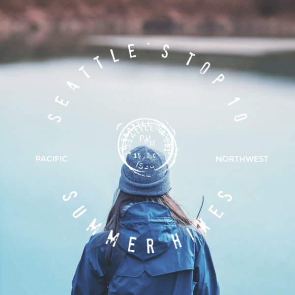
Click to customize this template
We all go to social media to see what’s happening in the world and what our friends are up to—you could even say that social media posts are the modern day postcards. Although, in these humblebragging times, they’re a little less, “Wish you were here!” and often a lot more, “Aren’t you so jealous I’m here?” Either way, boost your travel pics with a little extra to upgrade them to first class.
Create this look in PicMonkey by starting with an image as your background. From the Text tab, click Add text to enter your words, then use the Text tools to adjust them. To curve your words, click Effects in the Text palette and select Curved Text. We finished off this post with a postal graphic right in the middle which you can find by going to Graphics > Travel & Transport > Postal Marks.
